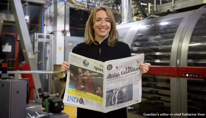
Reaction: The Guardian’s new look and tabloid size
The Guardian has been redesigned and its print edition is now tabloid format. As ever with change, the new look, masthead, colour scheme, font and size has divided the public, with some believing the it really works, while others think the Guardian has stepped back in time.
The redesign is part of an ongoing cost-cutting exercise at the paper, in an attempt to reduce significant losses; The Guardian plans to break even in 2018/19. As reported in Press Gazette, the new-look also spells the end of regular columns from Paul Mason, Deborah Orr and Giles Fraser.
The Guardian has, itself, curated reactions from the media industry, including The Daily Telegraph’s masthead now including ‘Britain’s biggest & best quality paper’, and The Sun’s ‘£1.50 less than tabloid Guardian’.
Over on Twitter, a big concern is that the redesign has made the paper too similar to other publications; whether that’s The Times’ Twitter profile pic:
(gah the guardian and times now look the same scrolling through a twitter feed) pic.twitter.com/x06sJpudWi
— Mark Di Stefano ?? (@MarkDiStef) January 15, 2018
Or the Evening Standard’s print edition:
At first glance, the new look tabloid Guardian put me in mind of the London Evening Standard… anybody else? pic.twitter.com/1qwyx4W886
— The Media Blog (@TheMediaTweets) January 15, 2018
How much money do you reckon the Guardian spent to look just like the Evening Standard? pic.twitter.com/UHPWHwIPVi
— murray (@muzrobertson) January 15, 2018
And if this tweet is believed, the paper might be moving into a new line of doing ‘favours’:
Has anyone else noticed something familiar with The Guardian’s new look?@guardian #Guardian pic.twitter.com/ahtMPHiX58
— SteMcKenna?LFC (@SteMcKenna) January 15, 2018
Some have expressed concern of the practicalities of the size change now it’s smaller; including this letter from a ‘reader’:
Best letter on Guardian going tabloid pic.twitter.com/V6u1Ne9Q8l
— Ken Sweeney (@KenSweeney) January 15, 2018
And this cartoon:
Sneak peek at this weeks Clare for the NEW LOOK @guardian ! Works better on the page… pic.twitter.com/j8ZSNxeXsp
— harry venning (@harrymvenning) January 15, 2018
For some, the lack of being able to customise the print experience is just too much:
In tears over new look at @guardian – sport on front, many pages of sport at the back – can’t rip it out. Not my paper any more.
— Chris Marsh (@ChrisEMarsh) January 15, 2018
The publisher has been praised for consistency across all mediums:
I like the Guardian’s new look. It’s nice that it’s consistent across their different outlets (web/app/paper) too. https://t.co/zxt1Ttligw
— Darren Di Lieto (@darrendilieto) January 15, 2018
Though not all design choices are universally liked:
New look @guardian app. Immediately assumed the horizonal lines implied hidden cards behind the top layer, and swiped down to see what they were. But they’re just a design choice. #UX And I miss the blue. The black and white is very stark. pic.twitter.com/Yer2eKcCUt
— David Hunt (@d_p_hunt) January 15, 2018
WTF? I would write a scathing critique of the new look tabloid @guardian but I can’t get past the T on the masthead. It looks like someone’s Letraset ran out of proper sized capitals. pic.twitter.com/GoEyNva2e9
— Alex Gordon (@alexgordonrmt) January 14, 2018
What do you think of The Guardian’s new look? Let us know on Twitter @Vuelio.
No matter what it looks like, The Guardian is still listed in the Vuelio Media Database, along with all of its journalists and editors.


Leave a Comment